
Ever since the first attorney stood up and disagreed with someone else for the first time, litigation and mediation have always been conducted face-to-face. There never is, and probably never will be, a substitute for a living, breathing, talking human being standing in front of a room, convincing, arguing and reacting.
But in the era of COVID, when that’s not possible, how do you win a case? What tips the scales? In an online proceeding, where can you still find an edge? What is, as the old television commercial used to say, the next best thing to being there? After literally centuries of advocacy being person-to-person, when that’s not an option, what is?
Exhibits. Graphics. Which is what we do at Knox Design Strategy.
When you can’t advocate for your client in person, the impact of a professionally-produced, powerful graphic presentation can’t be overstated. A picture really does tell a thousand words, especially when it’s in service of your case. You can’t slide exhibits across a table for another person to examine, or present them on an easel in a courtroom – they’ll be on a screen. Used properly, however, this can present a lot of advantages.
Science supports this. According to the Visual Teaching Alliance (SHIFT eLearning), our brain can see images that last for just 12 milliseconds, and our eyes can register 36,000 visual messages per hour. 90% of the information transmitted to the brain is visual, and visual information is processed sixty thousand times faster than text. 40% of nerve fibers are linked to the retina.
Here at Knox Design Strategy, we’ve created literally thousands of images in every conceivable format and for every imaginable purpose. Increasingly, we’ve found ourselves building exhibits for trials and mediations. While this work draws on our longstanding expertise in graphic design, it requires some additional strategies be brought to bear.
In addition to looking good, our work in these settings has to instantly and powerfully communicate information, often in highly pressurized, contentious contexts, with a great deal at stake. This information is often about subtle, or very complex concepts, or positions that are being disputed. Here are a few things we’ve learned about executing this well:

There are actually benefits to onscreen presentations. The first and most obvious benefit is that a well-designed onscreen image captivates the viewer and keeps them engaged, especially in the era of COVID. The pandemic has had a huge impact on people’s communication patterns, and visually compelling exhibits are an ideal place to leverage that fact.
When you present something onscreen these days, your audience has almost certainly been sitting through calls and webinars and Zoom meetings with their counterparts in little onscreen boxes for many months. They’re visually exhausted from this, suffering from a kind of screen fatigue. Week after week, they’ve been spending hours staring at computer screens, and unlike in pre-COVID times, doing almost nothing else.
In some ways, it’s more difficult than ever to keep people’s attention when showing them something on a computer monitor. Presentations onscreen, however, are an effective way to do that. All of these principles apply, of course, in a conventional live trial as well. But a remote trial vastly exacerbates the impact of these factors.
Powerful visuals help the audience retain messages both better and longer than any other form of communication. To be effective, it’s essential to keep them simple. Make sure the key message is onscreen, as clearly as possible, in a way that reinforces the point you’re making. Don’t go on too long, or your audience will be reading and not listening, but figure out what you really want to say, and get it up there.

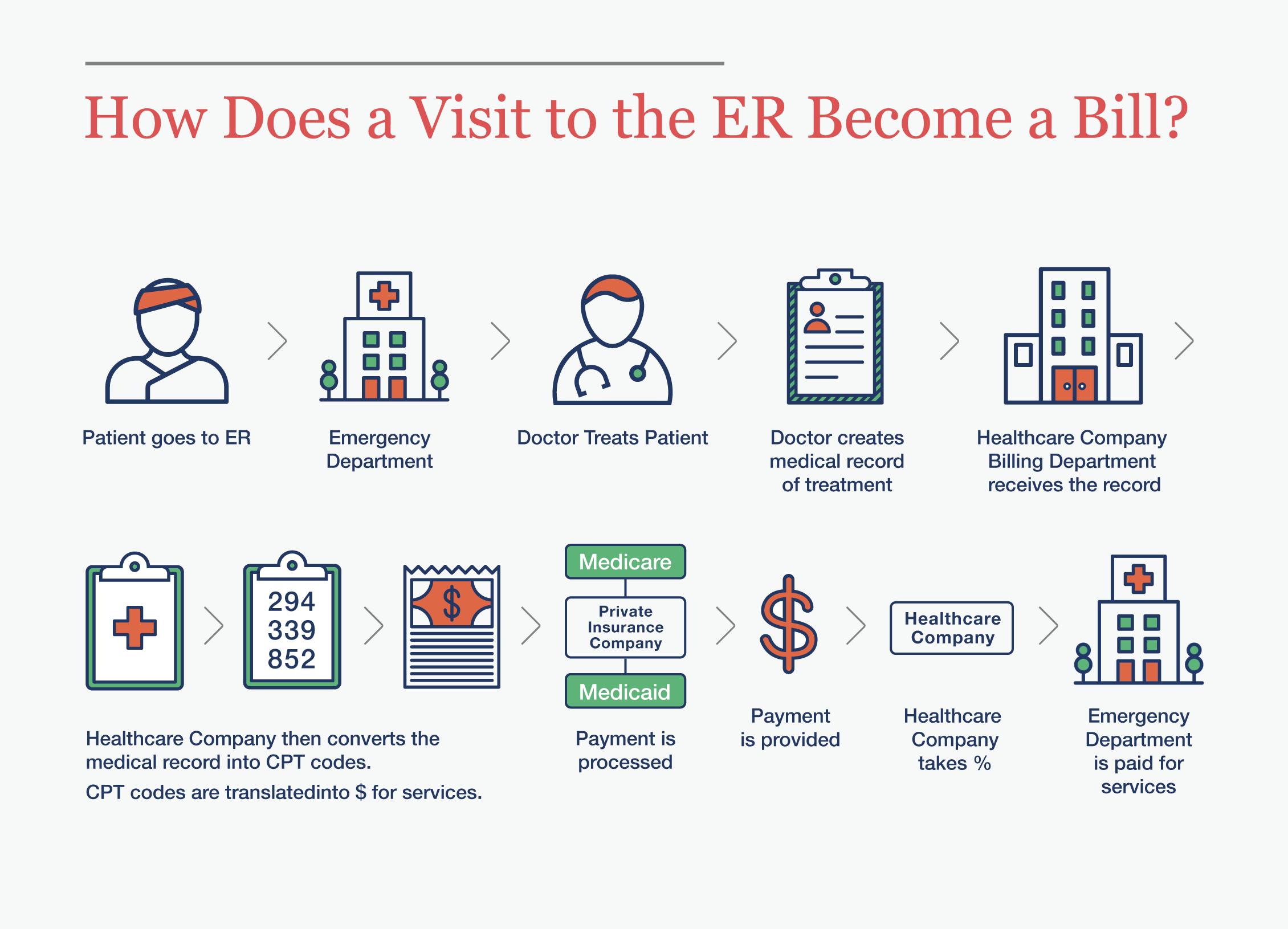
Onscreen graphics are particularly useful for walking the audience through a process, data or a complex relationship, and arriving at some kind of statement or assertion whether the audience is a judge, jury, arbitrator or mediator. The ability to click through a series of steps that build to a conclusion makes the information more easily digestible – the viewer receives it a piece at time. Here at Knox Design Strategy, for example, we’ve prepared infographics illustrating how a visit to the emergency room becomes a bill. Explaining this without an illustration would have been difficult, but an onscreen step-by-step illustration does the job nicely. Viewers easily understand what you’re getting at, which is the entire purpose of an exhibit.
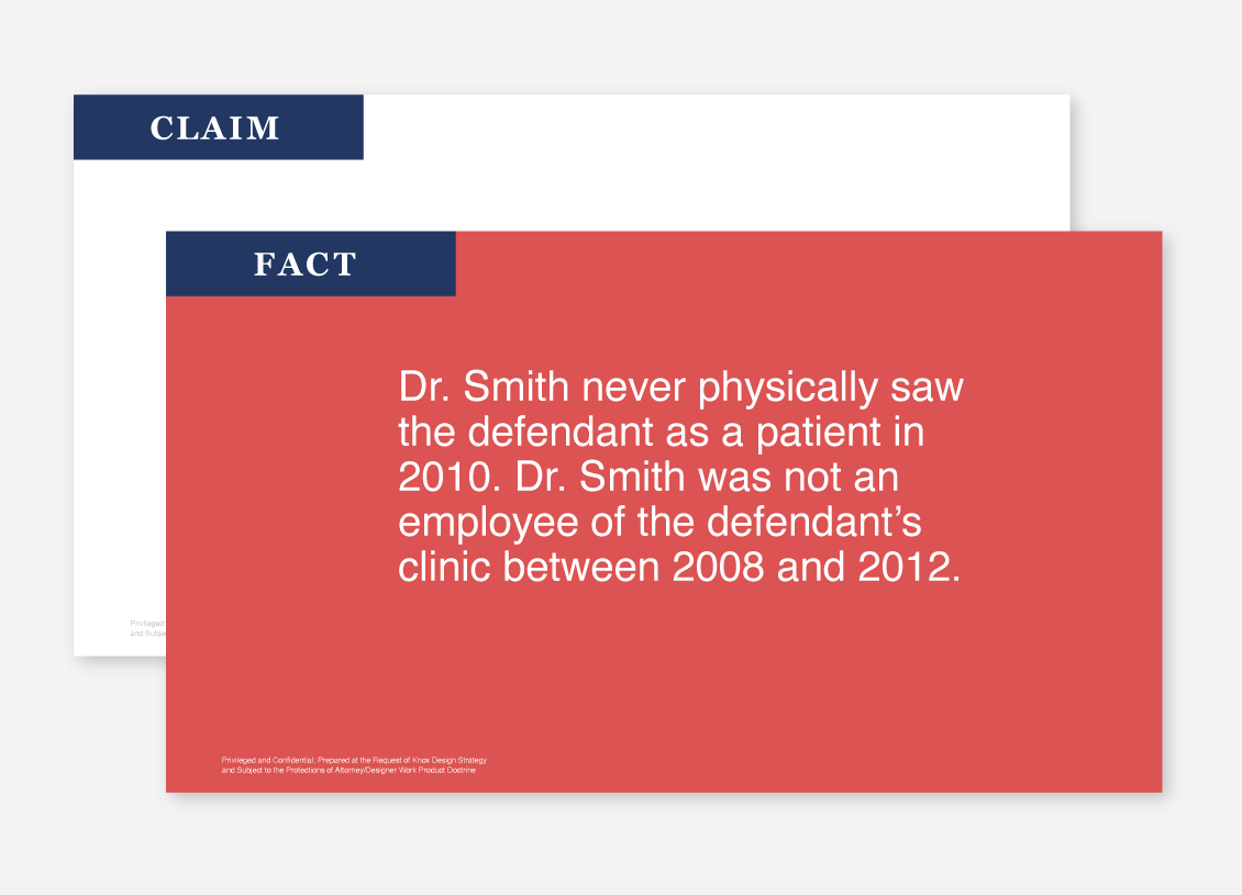
Onscreen presentations also allow you to make side-by-side comparisons between claims and facts, by including things like copy, deposition transcripts and quotes, and documents. Using this approach, you can talk through allegations, and discredit your opponent. Graphics have a special impact in these settings – putting your opponent’s statements onscreen and then disassembling them, step by step, can be hugely powerful.
There are relevant considerations to keep in mind. The first of these is the simplest, and the most important. When preparing these presentations, the deadline always comes right down to the wire – always. When it comes to creating exhibits, Parkinson’s Law definitely applies – work seems to expand to fill the time available, particularly when attorneys are involved. To manage this, it’s essential to have the look and feel of exhibits signed off on prior to entering the content. Determine the key visual criteria upfront and iron it out, so the team can focus on the content itself.
More specifically, know who the key stakeholders are and get buy-in from them on the early side, so that the approval process is removed from the equation as your team is working through content. You don’t want to get sidelined because, say, the lead attorney objects to the branding at the last minute.
Finally, visual cues and images trigger emotions. They elicit much faster and stronger reactions than words, because the part of the brain that processes images is also the part that processes emotions. This is clearly important when you want to persuade someone, as in a trial or mediation. However, images have to be relevant and well-chosen and presented clearly. Off-topic graphics, such as obvious stock images, graphics that are of poor quality or are obviously just for decoration will impede the intended message.
The bottom line? In the challenging, unprecedented and, God willing, temporary time of COVID, images can be powerful allies in advocacy. They have an impact, immediacy and effect nothing else can match. They’re an attorney’s best online friend. And here at Knox Design Strategy, they’re what we do.


