Hirschfeld Kraemer
Rebranding a Labor & Employment Law Firm


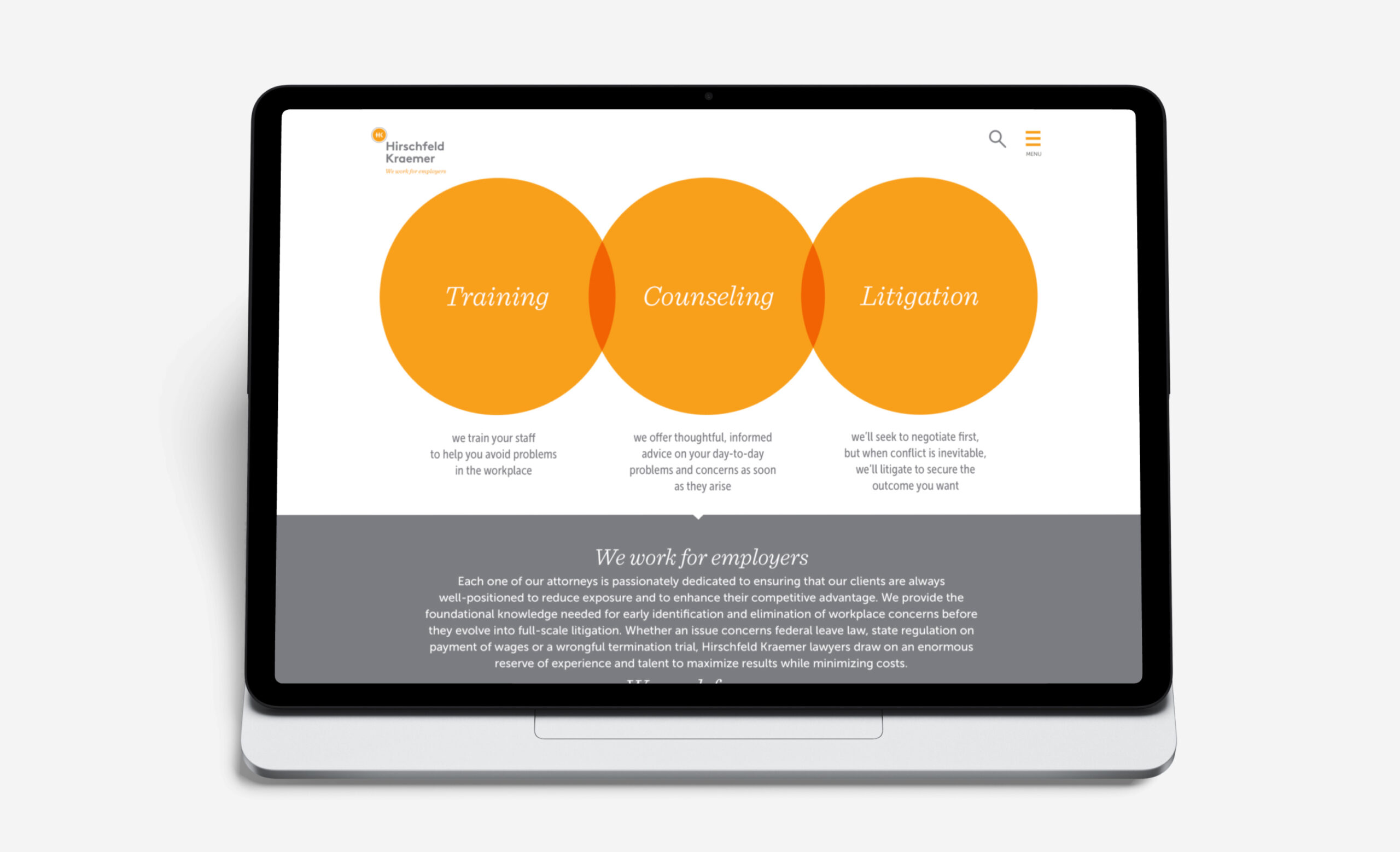
We were delighted to work with Hirschfeld Kraemer, a West Coast labor and employment law firm. After thorough research and an on-site meeting with several attorneys, including the two founding partners, we determined that the firm’s work fit into three distinct areas – training, counseling and litigation. How could we visualize and communicate the three key areas while also reflecting the culture of the firm?
We continued to build on the concept of interconnectedness, not only with respect to the firm’s areas of focus, but also the importance of the employer-employee relationship. While exploring several creative concepts during our initial brand identity exploration, we all agreed that the three interconnected dots best capture the nature of the firm, its work and the human element. A single, bold dot then encircles the firm’s typographic monogram.
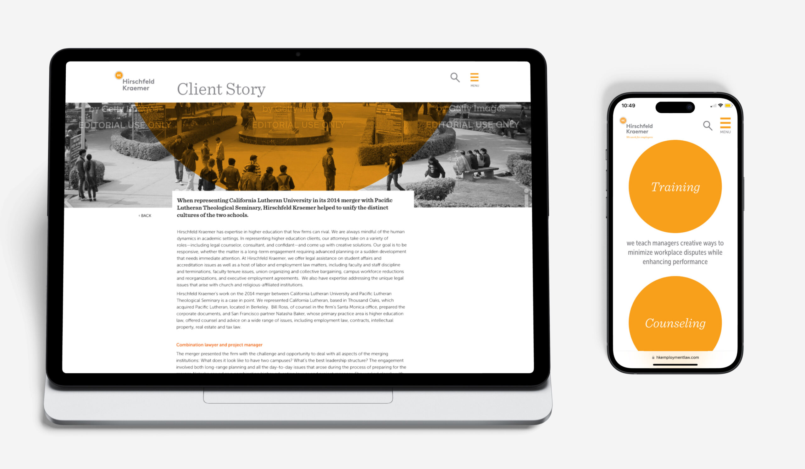
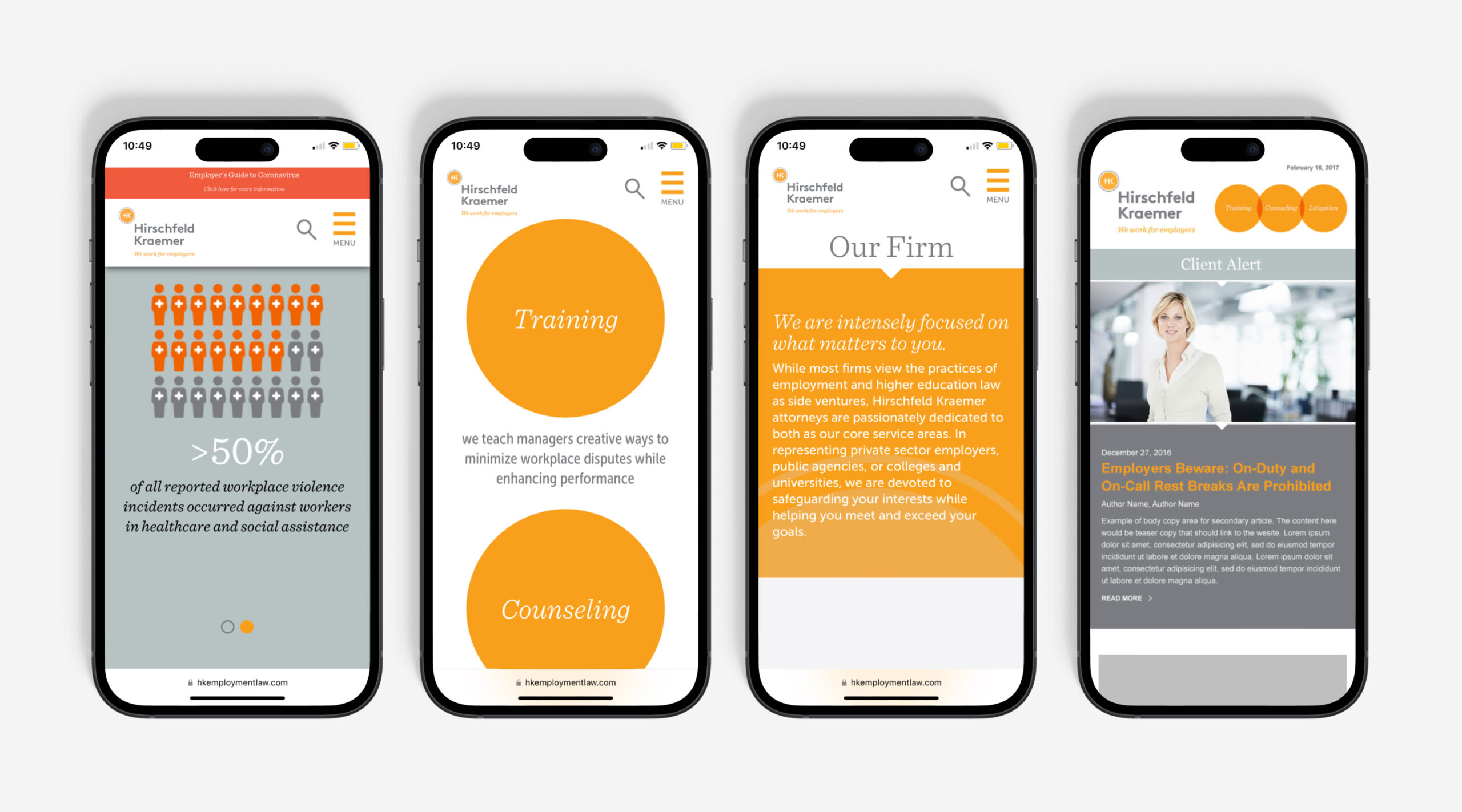
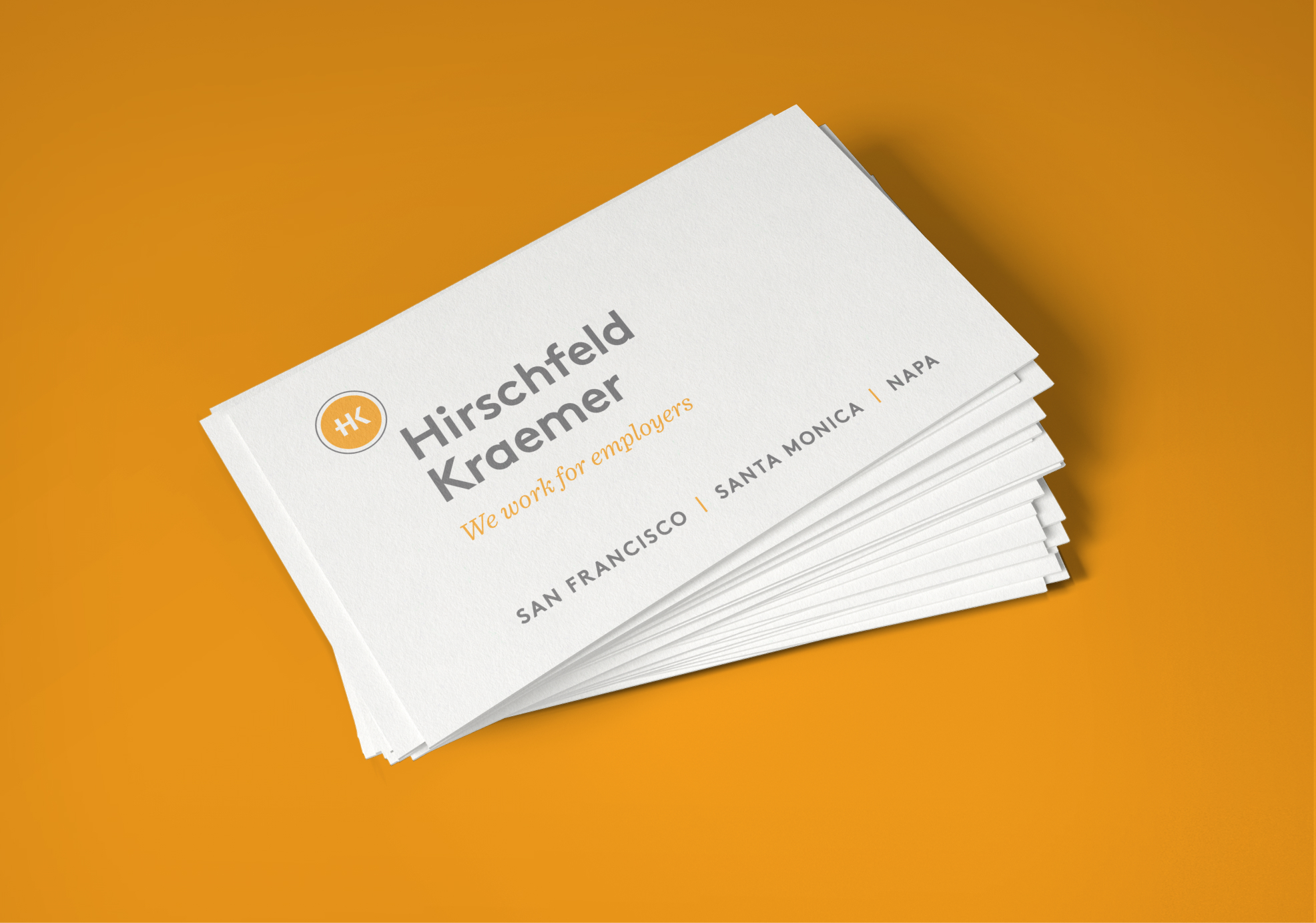
In addition to a full stationery suite, signage and email marketing template, we went on to design and develop a new website for the firm. The content-rich site now integrates the once separate blog and a new Resources section offering a growing library of articles and educational content. Those interested can now sign-up for the firm’s many training offerings through the Presentations & Workshops section, providing for a better experience on the registrant side as well as a more streamlined process for the firm’s administrative staff.
Attorney bios, written in a more informal interview style, help capture the personality of the individual attorneys while showcasing their work experience. Integrated Client Stories share concrete examples of how Hirschfeld Kraemer collaborates with their clients to resolve – or better yet, prevent – labor and employment legal issues.
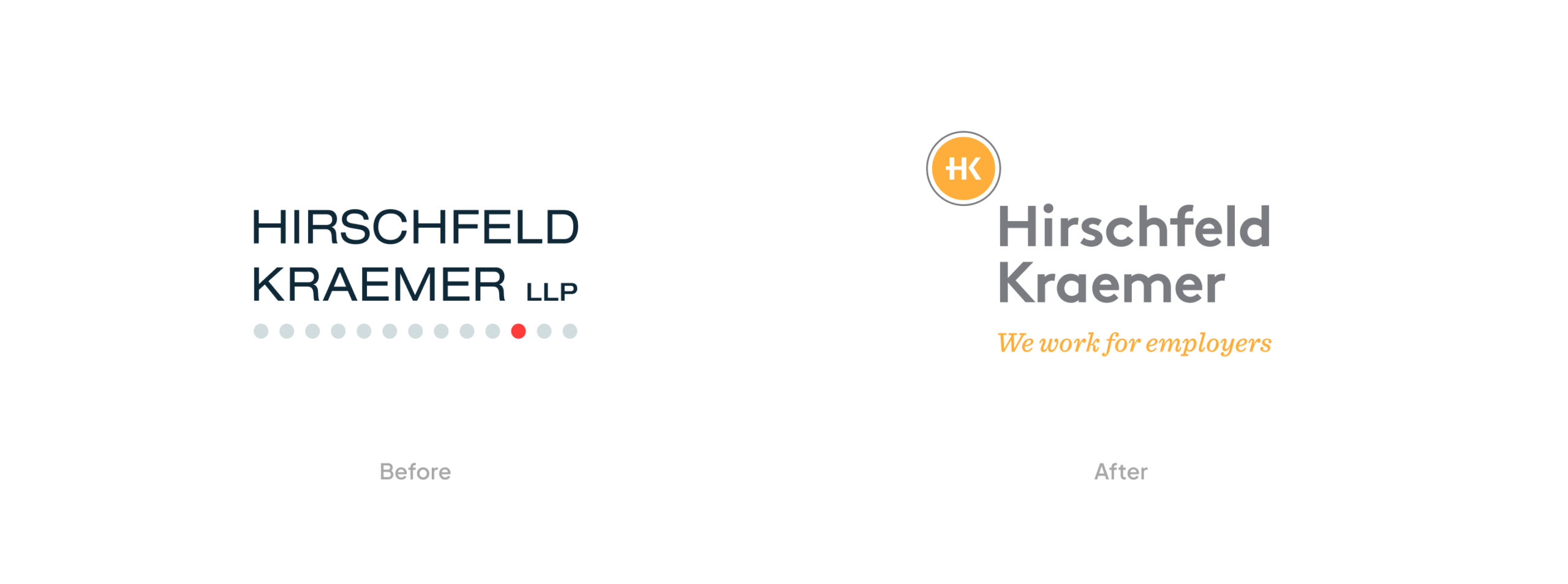
A single dot before and after – the single, bold dot now captures the firm’s typographic monogram while providing for a subtle throw-back to the firm’s previous brandmark.
Increased Traffic
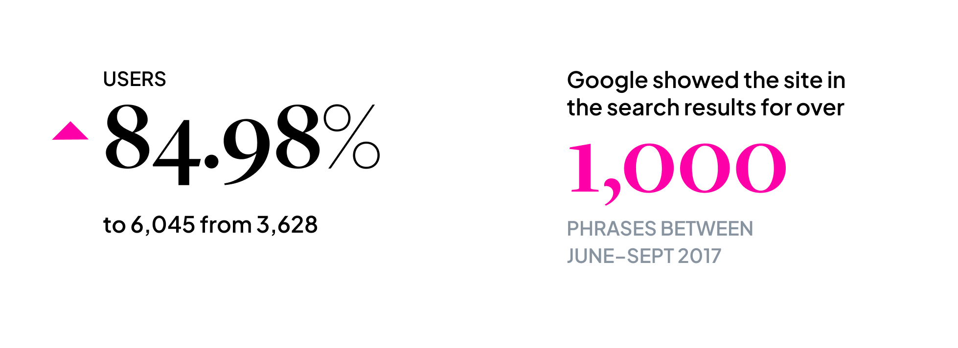
The new site brought more traffic and new visitors with an increase from 3,628 to 6,045 users.
Keyword Phrases
In addition to people coming to the site by searching for the company name, the site also received organic traffic from searches on a range of keywords.
